Case Study - 2020
Disney Rewards Redemption
In an effort to better engage the Disney Rewards users on the disneyrewards.com, as opposed to static screens of the multiple tiers of results drilling. This new filter system of the reward redemption location has been tested positively by Disney’s real users.
MY ROLE
Product Designer
Responsible for research, design, strategy, interaction design, and prototype
TEAM
Pete Kulek - Senior Copywriter
THE PROBLEM
Meaningful engagement in the filter system was very low — users weren’t interacting much on the current where to redeem locator. SEO rating is also really low due to the structure of the locator. How could we enhance the locator tool to make it more intuitive and SEO friendly.
We wanted to understand why the engagement was so low in the locator tool. Through conversation, site audits, data, and research, it became clear that the user experience was poor, and the interaction was cumbersome and extensive. I was able to pinpoint what caused the bad experience.
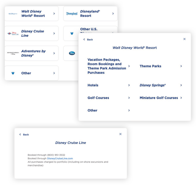
1. Requires too many clicks to get to the result tab
The locator tool was built upon an inconsistent structure. Therefore, some flows required the users to click 5 times to drill down to the result.
2. Can’t compare the result
The result card was a single card base design, the user will have to click the back button or start over the filter to view a different result. Therefore, only showing one result location with the number of clicks does not add to a pleasant user experience.
3. Misleading copy
The copy for each level of filter is not well thought out. Therefore, there was flow where the same copy was used at different levels throughout the experience and had caused frustration where the users didn't know which level they were at.
Speed up search experience
Disney Rewards locator tool has one sole purpose — it is a tool where users come to this place to see where they can redeem the rewards they earned. Our vision for the new location was to promote ease of use, SEO-friendly, and ultimately the goal would be the main tool for users when they needed to look up where to redeem their rewards. The redesign allowed us to scale the locator tool and place primary focus on ease of use. We were able to restructure the database for future updates which was a plus for Disney.
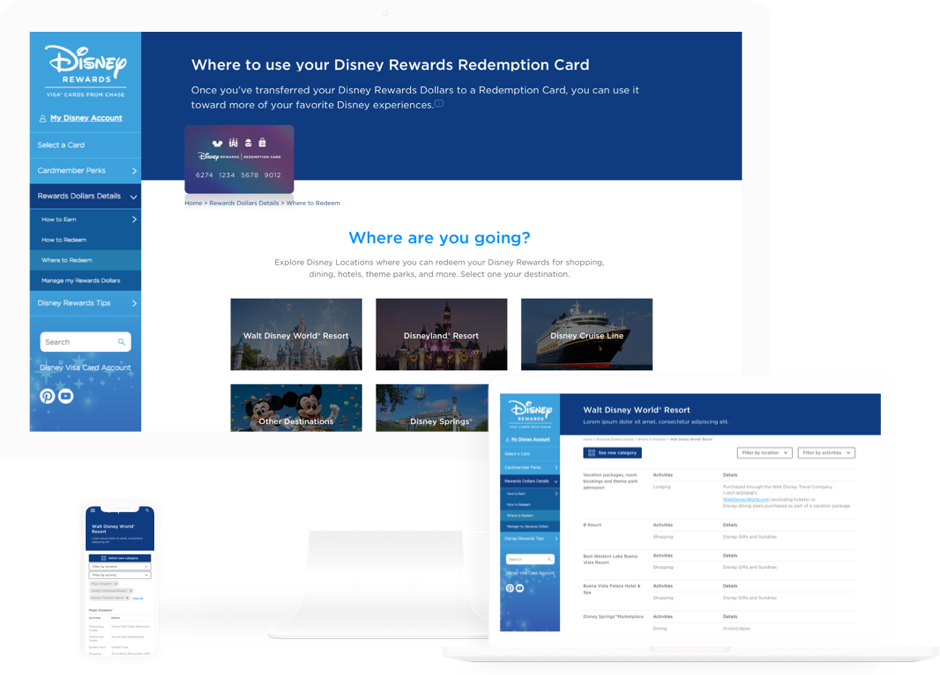
Before — Old filter tab design with limited interactions and was not easy for search engines to pick up. Therefore, the page was ranked really low.
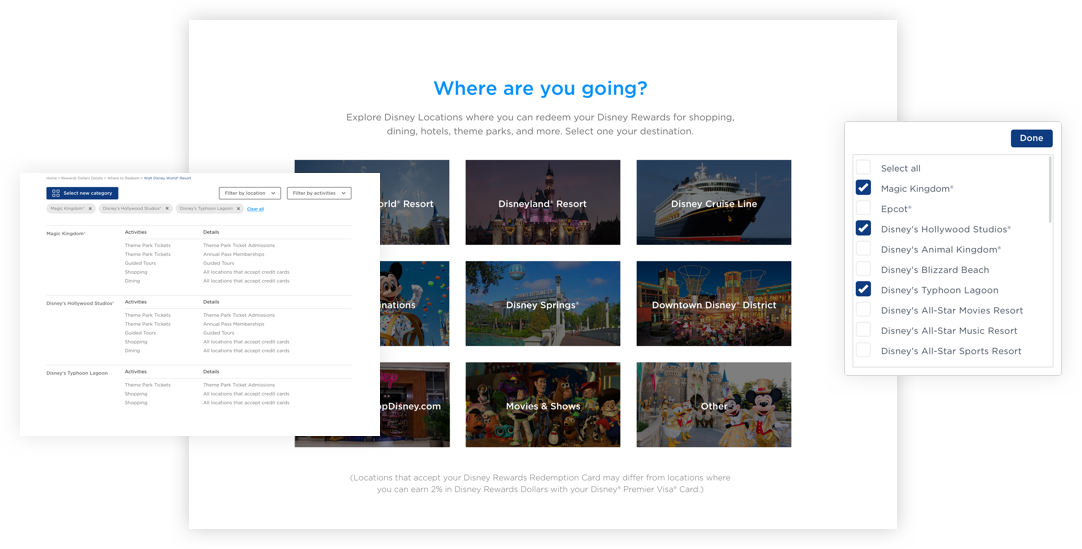
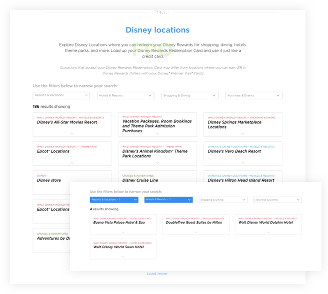
After — The new locator tool was easier to use, allowing the users to jog down a list of places where they can redeem their rewards while planning for their trip. Also, this structure allows for the search engine to pick up relevant information in a hierarchically organized fashion.
Improve discoverability
Disney rewards did a good job of cross-linking the locator tool in various subpages but reviewing the entire user experience. The majority of the users land on this through google search, therefore, although the value of cross-linking was present, it does not directly affect the majority of the users’ experience. By bringing more prominence to the locator tool within the “Where to Redeem” page was our ultimate goal.
Solutions
- Discoverable within the “Where to Redeem” page
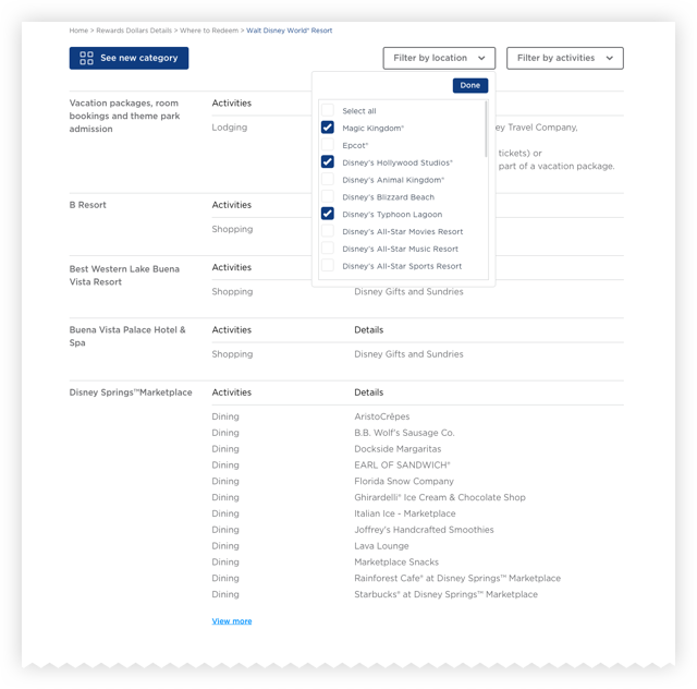
- Comparable result
- Narrow down results if needed
Early exploration of the filter navigation using color-coded tabs. I tested over compliance and found that people with low vision might find this less useful.
Improve SEO ranking
In order to quickly improve the SEO ranking of this page. We introduced a new data structure and tagging system for the result list. This made it easier for search engines to pick up the resulting tile quickly ultimately increasing the overall site ranking.
Solutions
- Delivered a new SEO tagging system
- Reduced duplicate content within the page
The result
It was really exciting to see the work I’ve created being used by a vast audience and has helped improve their browsing experience on the Disney Rewards website. Not only did the work bring a successful experience to the users, but this project was also a really great partnership between the agency and Disney Rewards.
"... the feedback from the agency partners we work with has been positive. Everyone is remarking about how much easier it is to find locations. In fact, our social media agency mentioned they learned about a new location of where to redeem, just because of the new interface and the search result!"
Jason Saculles, The Walt Disney Global Marketing Manager