StockX tag
STOCKX
Tag
Scaling Growth and User Experience Improvements at StockX
A collection of checkout, bidding, payment, order tracking, and internationalization improvements designed to make high-intent marketplace moments clearer, faster, and more trustworthy for buyers around the world.
Transaction Logic
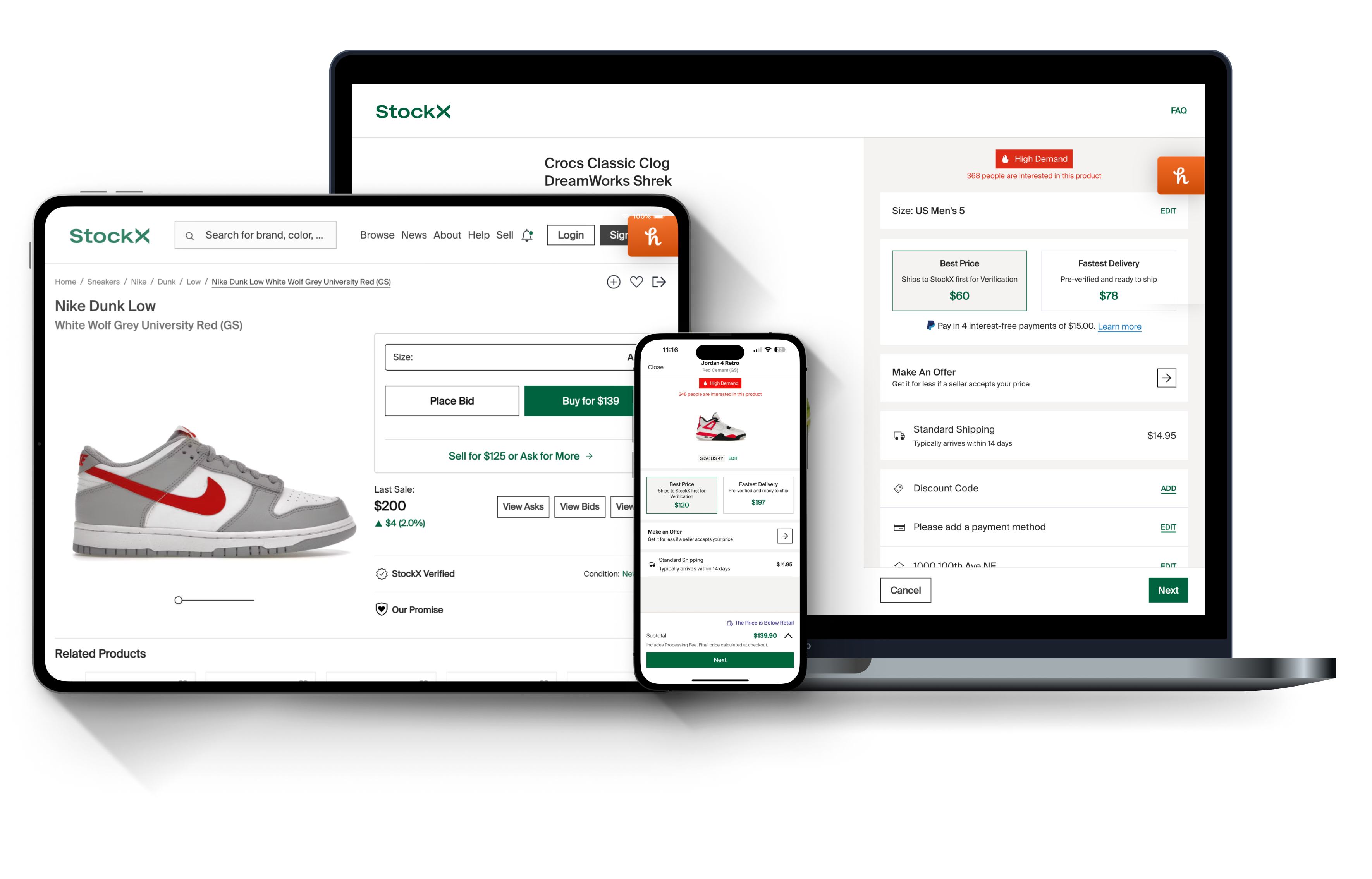
StockX checkout needed to support multiple paths: Place Bid, Buy Now, Purchase, and View Order. Each flow had different rules, but the experience still needed to feel consistent and easy to follow.
I worked on making fees, shipping, taxes, and final totals easier to understand before users committed to a transaction. The goal was to reduce surprise costs and help buyers feel confident at checkout.
View Order needed to translate backend order states into clear user-facing steps. Seller shipment, authentication, carrier handoff, and delivery all had to feel understandable without exposing unnecessary complexity.
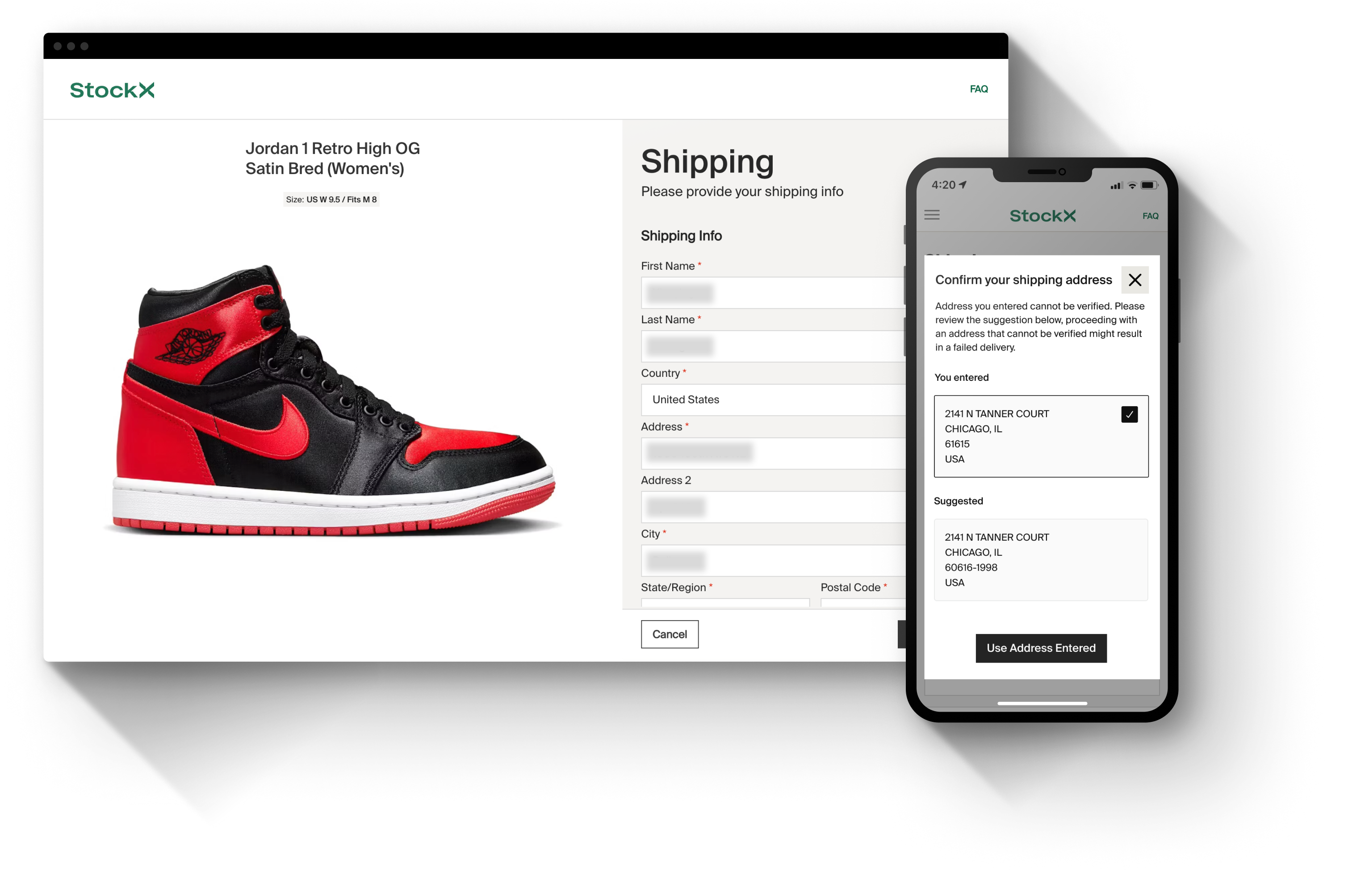
Address validation and payment logic had to support regional differences. This included helping users enter accurate shipping information and understand what was required based on their location.
Across the experience, I focused on the moments where users might hesitate:
Did my bid or purchase go through?
Where is my order?
What happens next?
Product Strategy
The strategy was to make complex marketplace operations feel simple on the surface. Each improvement supported a larger goal: reduce friction, increase buyer confidence, and scale checkout for a global marketplace.
PROJECT OVERVIEW
StockX operates at the intersection of commerce, authentication, pricing, and marketplace trust. Across multiple product initiatives, the work focused on improving the moments where users make decisions, place bids, complete purchases, track orders, and resolve uncertainty.
Rather than treating each feature as an isolated flow, the strategy was to strengthen the transaction journey as a connected system: reduce ambiguity, improve confidence, support global expansion, and make complex marketplace mechanics easier to understand.
Projects, Insights, and Results
For each project I tackled, I made sure we targeted specific user challenges, with research insights driving design solutions, and that helped me to gain measurable outcomes.
Leveraging quantitative data to drive design decisions for impactful user experiences.
Conducted user interviews to validate the viability of each design solution.
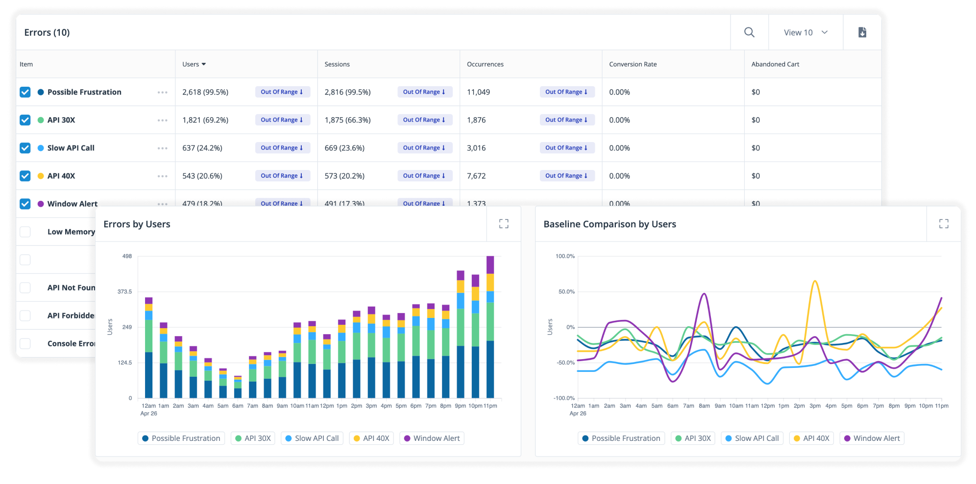
ORDER TRACKING
By examining the user journey map, consulting with the customer service team, and reviewing feedback in community forums, we identified the need to enhance not just the pre-checkout experience but also the post-checkout experience, especially for high-value purchases. As a result, we prioritized designing a robust order tracking feature.
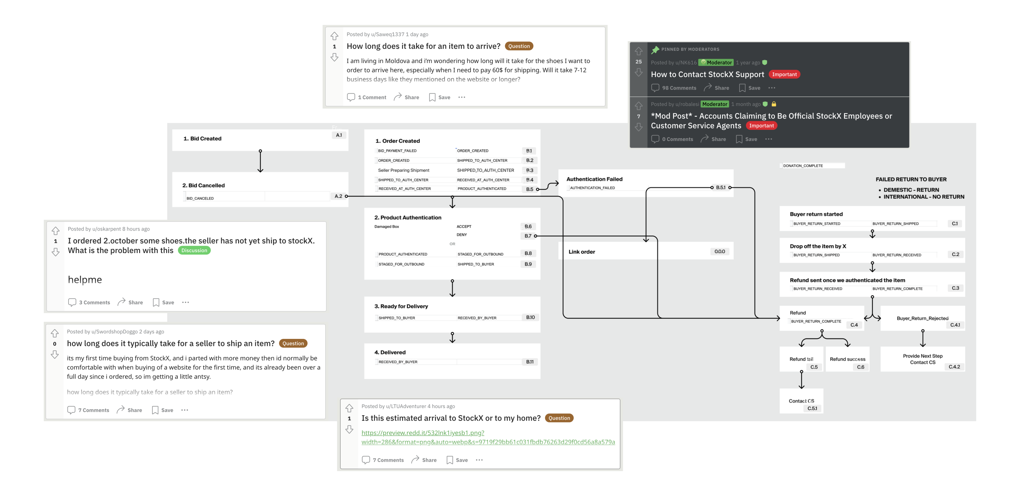
After several rounds of design iterations and testing, this is the final design.
RESULTS
- Customer service inquiries related to order status dropped by 30%.
- User satisfaction with tracking increased by 45%, with positive feedback on the clarity and reliability of updates.
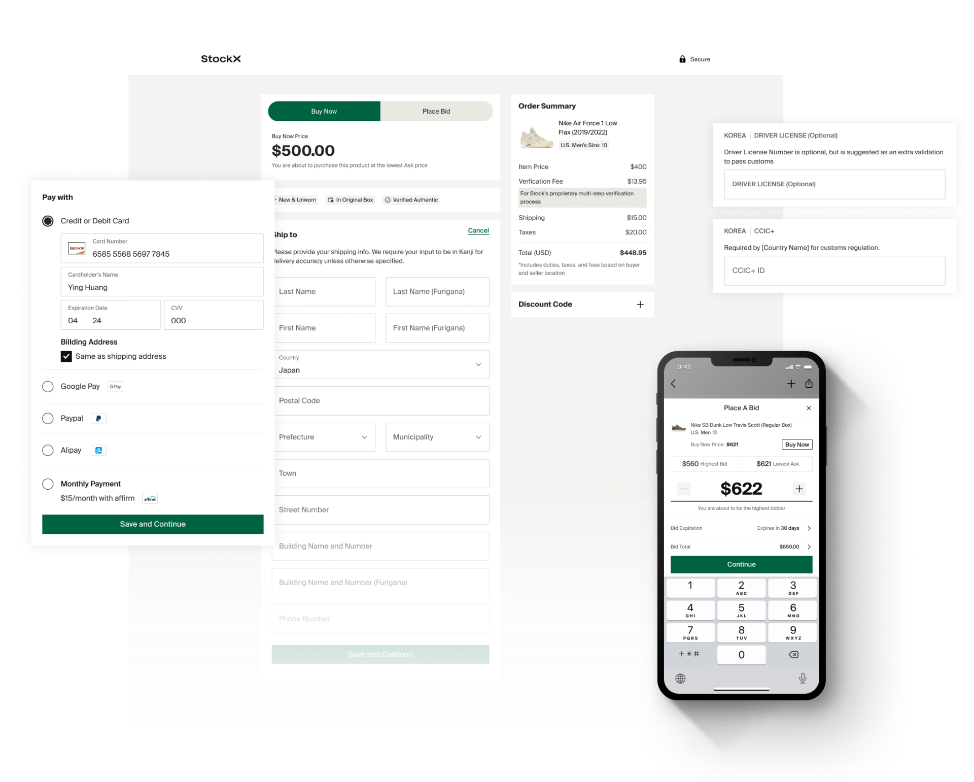
INTERNATIONAL ADDRESS VALIDATION
Incorrect address inputs, especially for international orders, caused delivery delays.
Research indicated that users needed real-time address validation tailored to regional formats to reduce delivery issues.
With StockX's initiative for pre-IPO focusing on international expansion, my goal was to enhance the experience for global users.
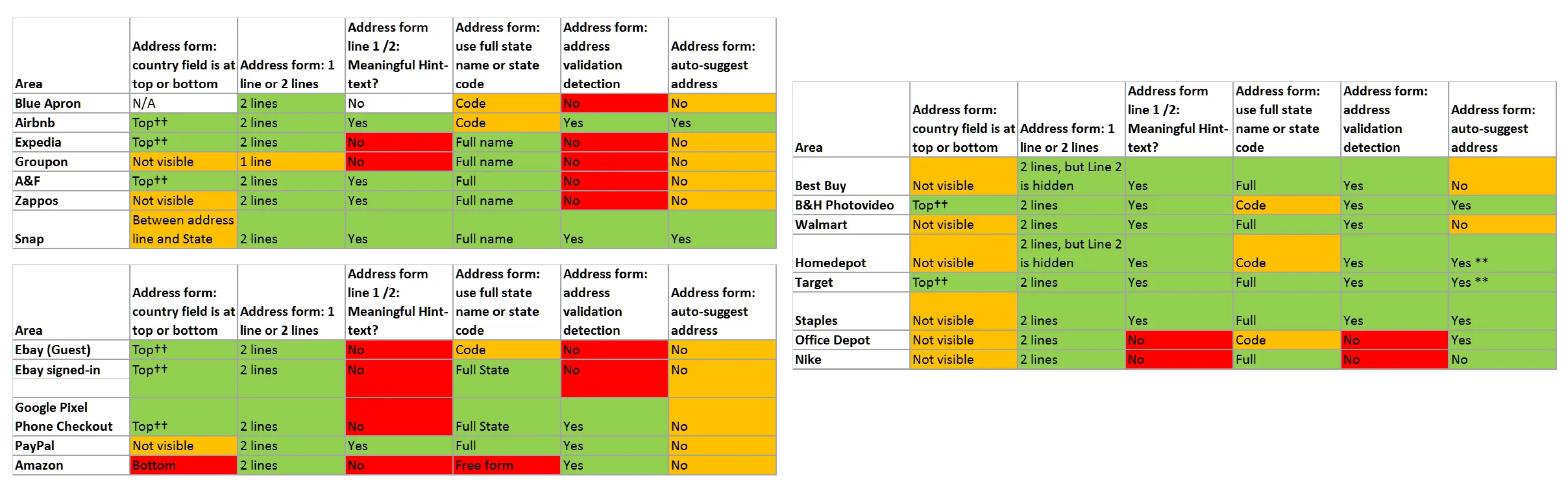
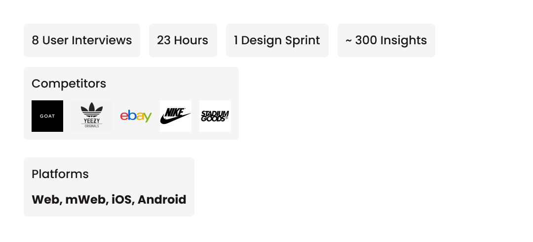
I conducted an in-depth analysis of address form inputs across major competitors, which helped inform and refine our design decisions.
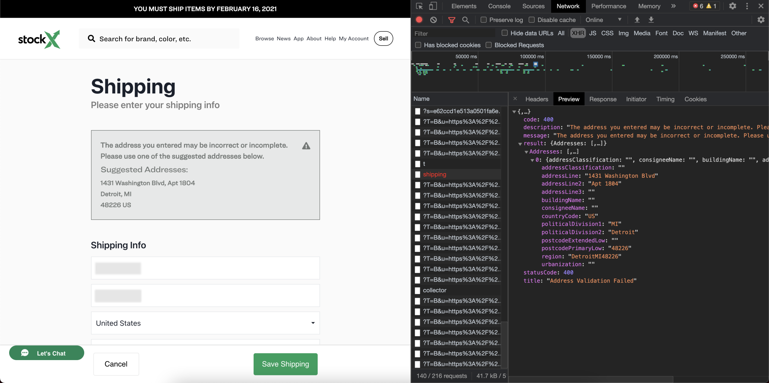
Analyzing the database to understand error handling and improve the user experience.
RESULTS
Delivery issues due to address errors decreased by 25%.
Successful international deliveries on the first attempt improved by 20%.
Price Transparency
Challenge: Hidden fees and unclear costs at checkout led to abandoned carts.
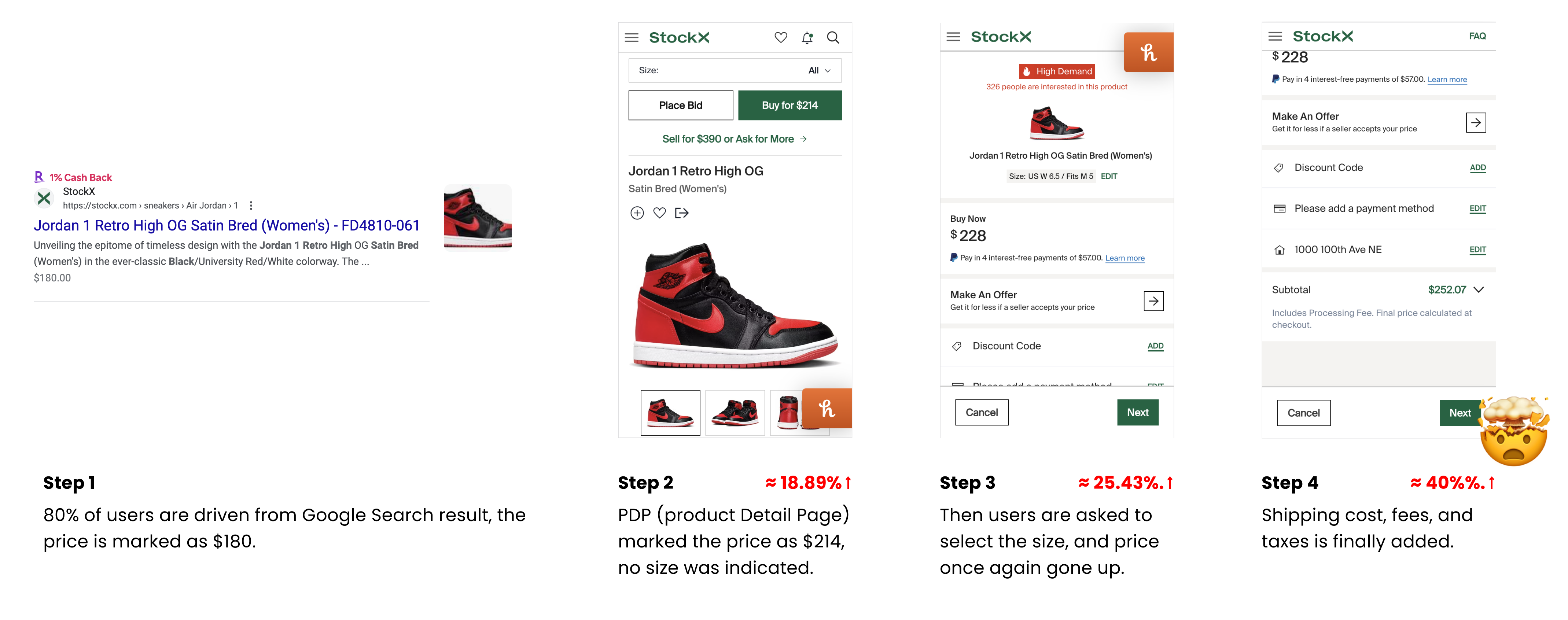
Insights: Users preferred an upfront, itemized breakdown of all costs (fees, taxes, shipping) to make informed purchasing decisions.
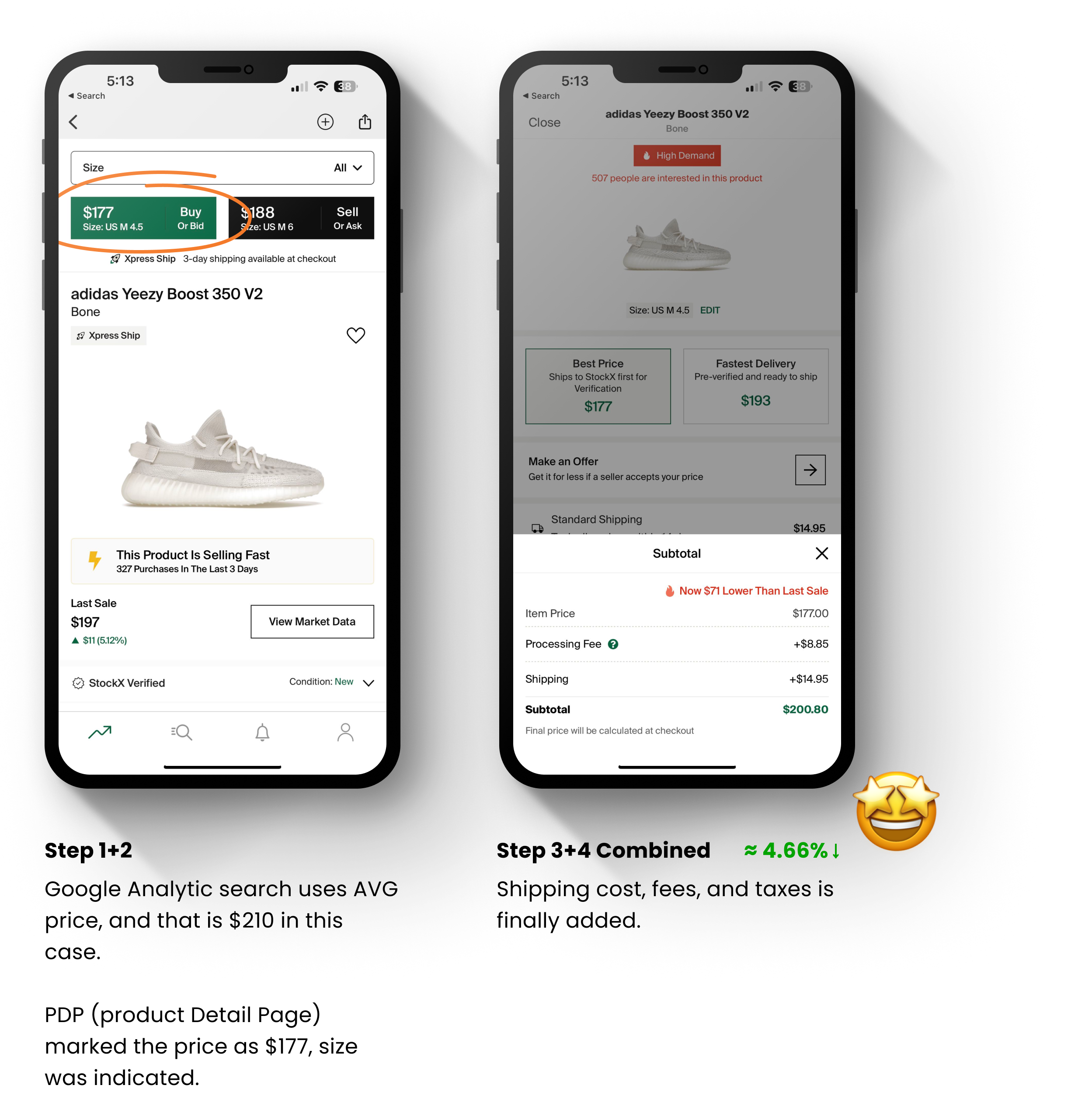
Solution: I designed a pre-checkout summary that dynamically updated to reflect total costs based on user selections.
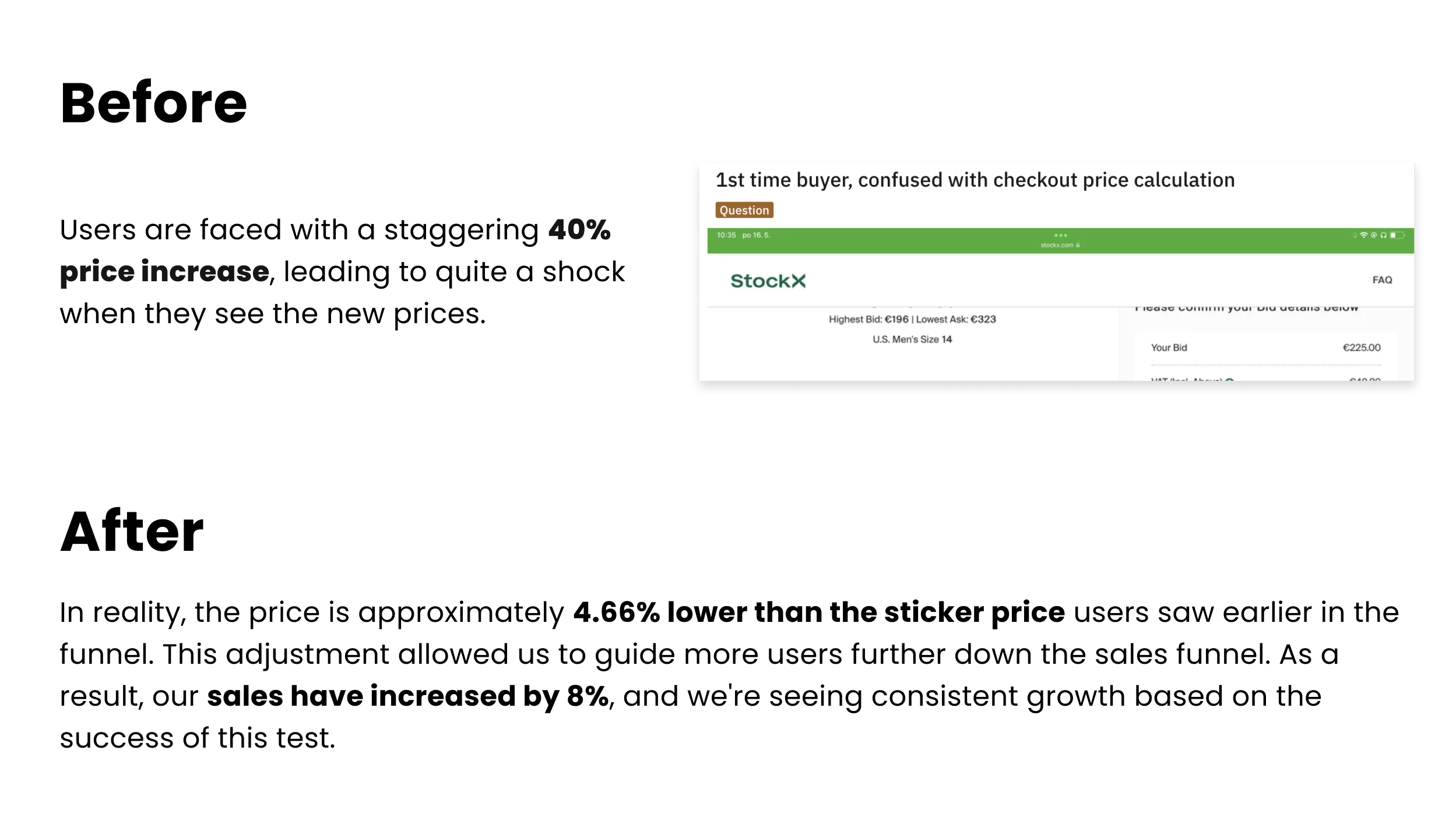
Results
Cart abandonment due to unexpected fees dropped by 18%.
Conversion rates at checkout improved by 22%, with users expressing greater confidence in purchase decisions.
Buy and Bid Flow Enhancements
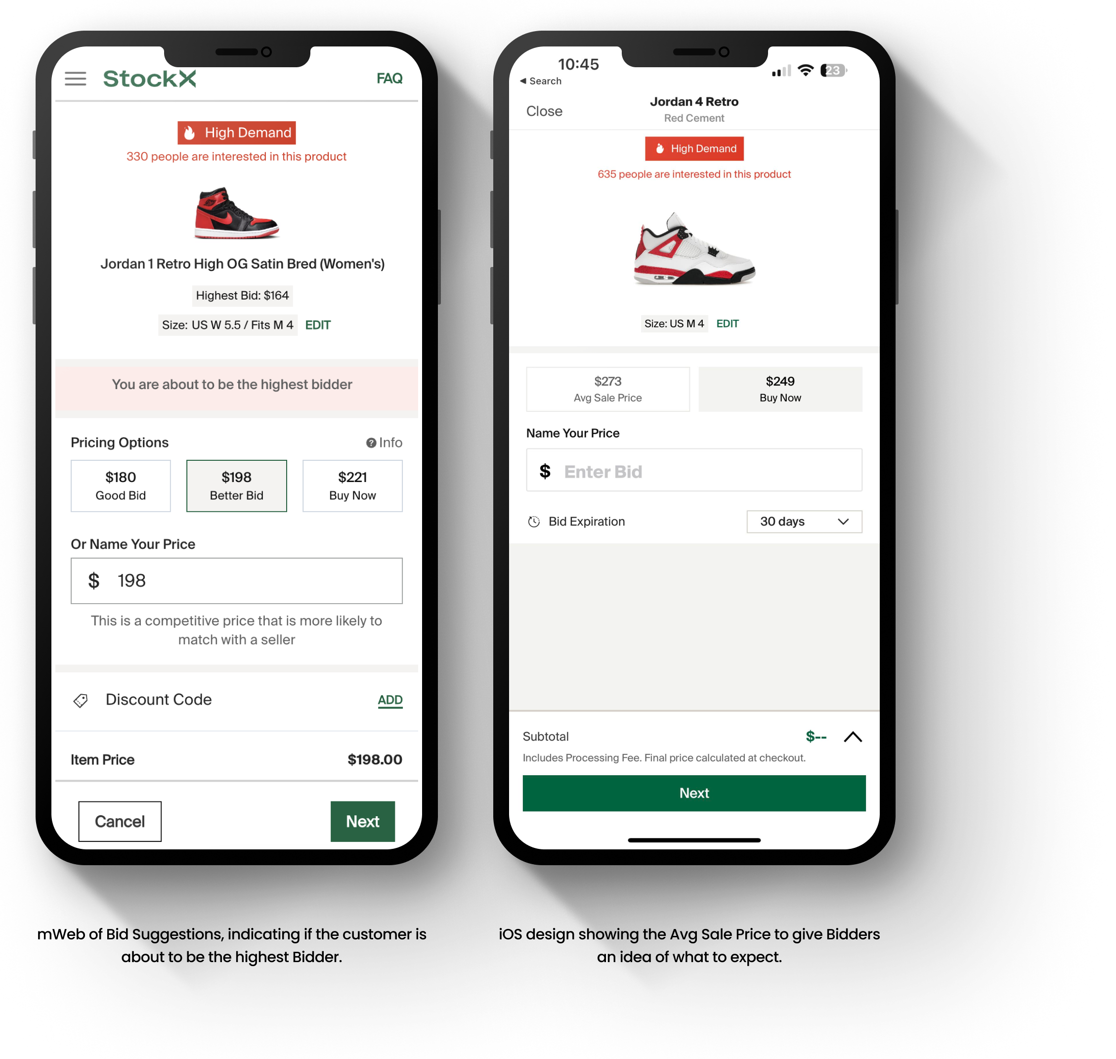
Challenge: Complex bid and buy flows created hesitation, reducing conversion rates.
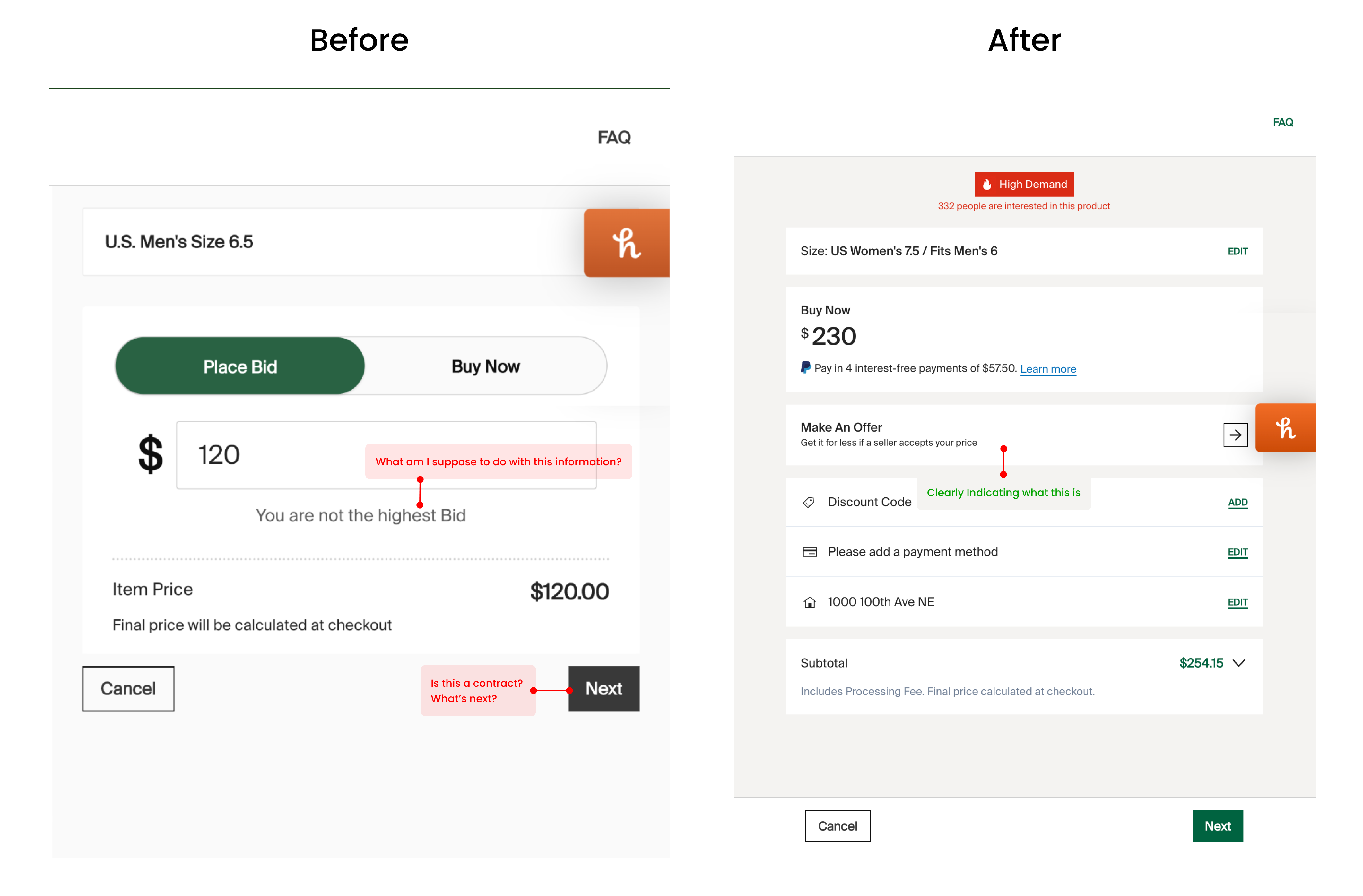
Insights: Simplified actions and clearer product authentication information boosted user confidence in bidding and buying.
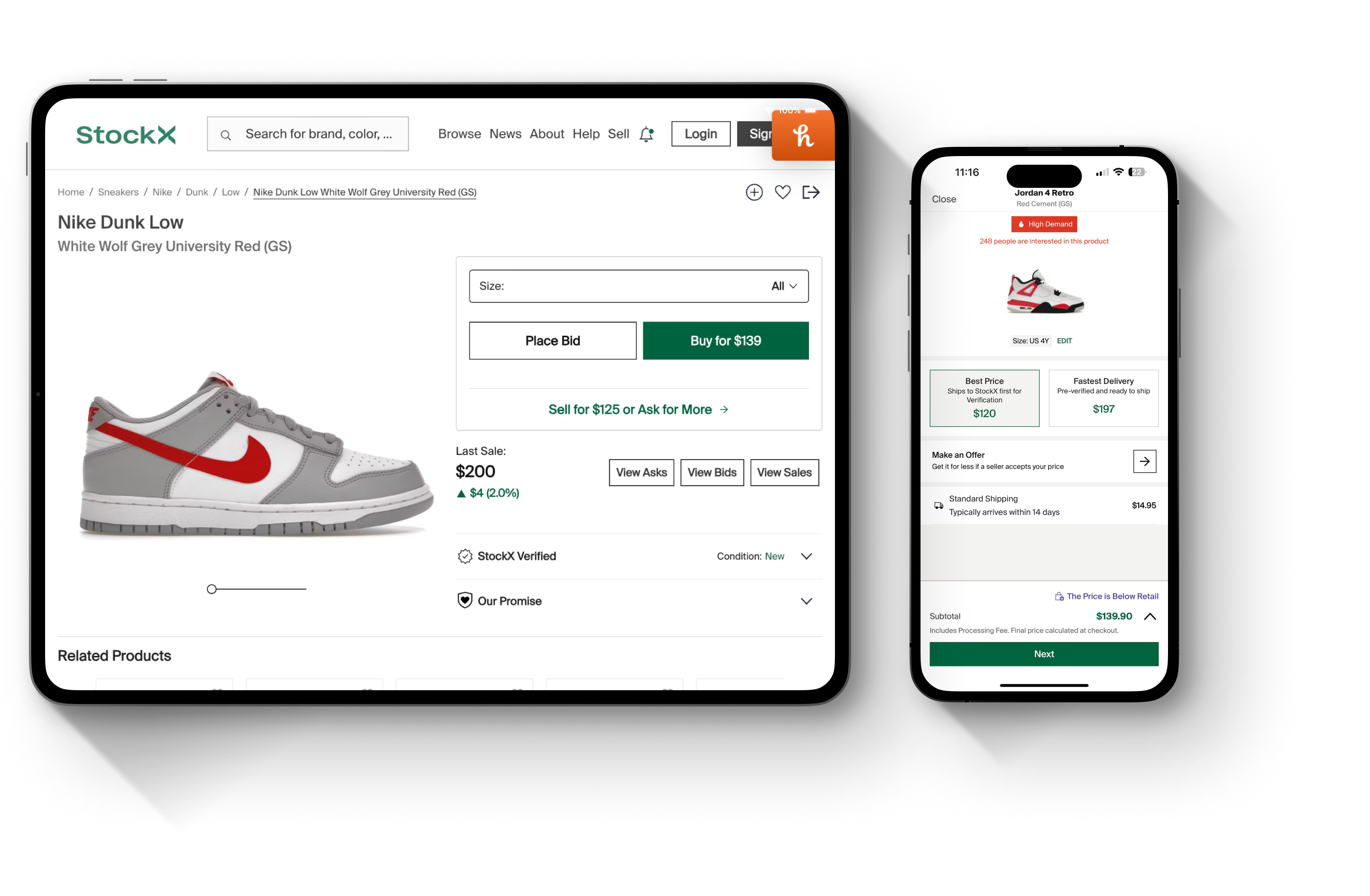
I streamlined the buy and bid screens, introducing quick actions and product details. A step-by-step guide for new users made navigation easier, while seasoned users benefited from faster completion options.
Results
Bid placement frequency increased by 30%.
Purchases from bids rose by 20%, reflecting improved user confidence in the bidding process.
Payment Updates
Challenge: Limited payment options and rigid flows added friction at checkout.
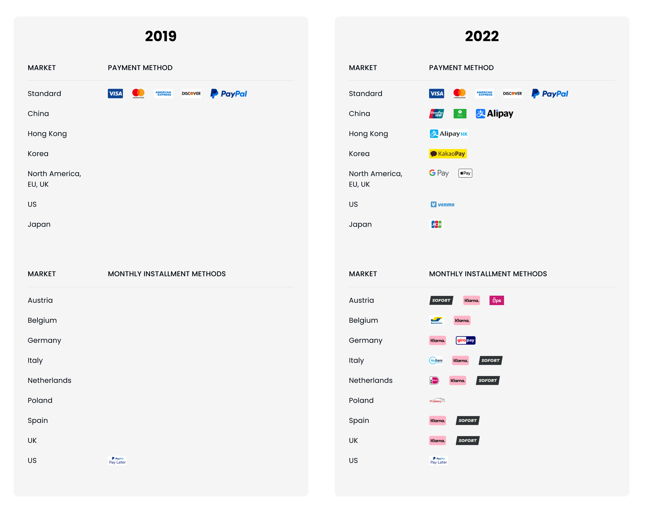
Insights: Offering diverse payment options, including international payment methods, could capture a broader customer base and enhance conversions.
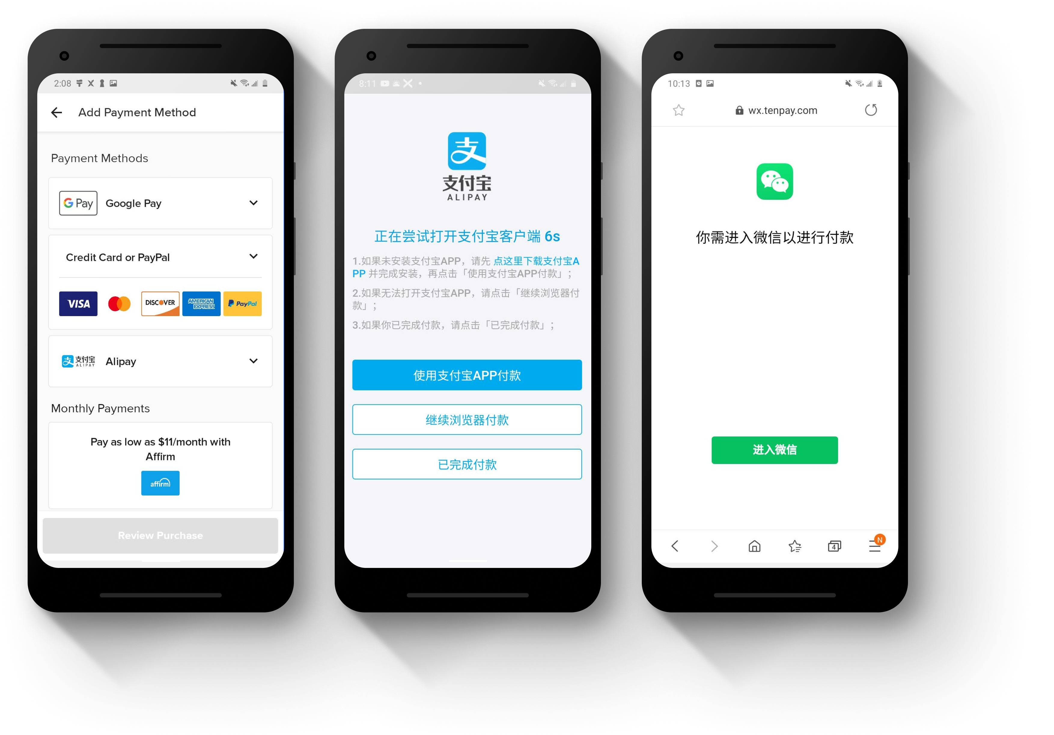
Solution: I introduced multiple payment types and allowed users to save payment options, displaying clear currency conversions and secure icons for confirmation.
Results
Conversion rates increased by 15%, especially among international users.
The new payment flow saw increased positive feedback for flexibility and security.
Transparency: Clear, upfront information fosters trust and reduces friction.
Localization: Region-specific adjustments in address validation and payment options were essential to serving a global customer base.
Future enhancements could include integrating estimated delivery times in the tracker, expanding payment methods, and setting up a continuous feedback loop to stay attuned to evolving user needs.